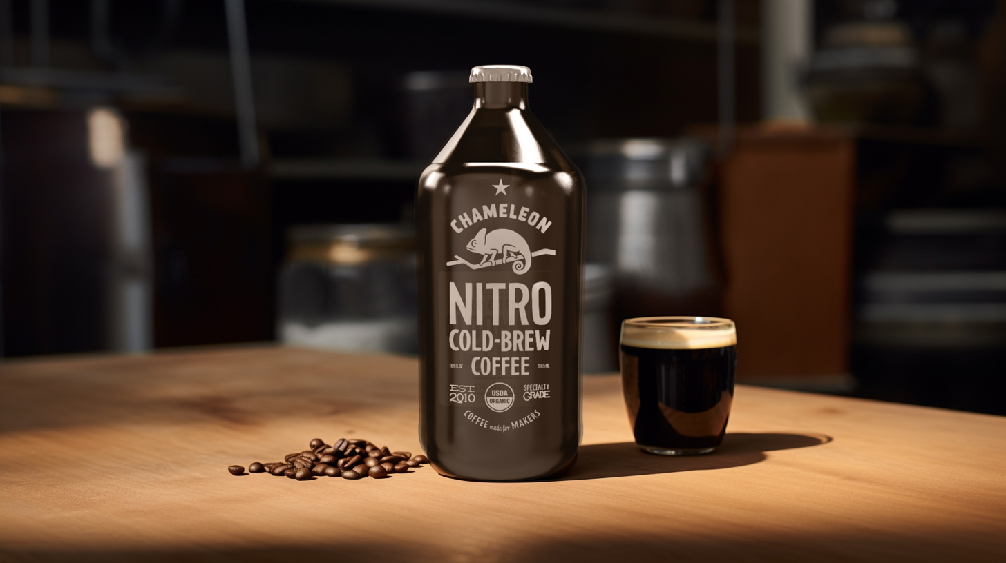
Chameleon Nitro Cold Brew Coffee’s speaks to the brand’s organic and energetic essence. The design employs a muted color scheme with earthy tones that reflect the natural, organic ingredients of the product, aligning with the environmentally conscious values of the target demographic. The packaging varies between cans and bottles, offering visual variety while maintaining brand consistency with the use of a prominent chameleon logo, reinforcing the brand’s adaptability and focus on quality. The typography is bold yet straightforward, ensuring product details like ‘Nitrogen Infused’ and flavor notes are clear and immediately identifiable. The choice of aluminum cans and glass bottles may suggest a commitment to sustainability and quality, appealing to eco-friendly consumers who also appreciate the premium nature of specialty grade coffee. The effectiveness of the design is ultimately measured by its shelf impact and its ability to attract and retain the attention of consumers in a competitive market.

Leave a Reply